EVEN though DESIGN Canberra has finished, the exhibition “Women in Design”, which opened a little later in November, continues to mid-December.
And, rather than one exhibition, it consists of four small solo shows in the same space.
The artists are four young women, most of who have been working for several years and are becoming known in their media scene – ceramics, jewellery, wood and metal.
As Anne Brennan explains in a short essay accompanying the exhibition, the curatorial focus for the festival revolves around the modernist antecedents of the city of Canberra, and she states that domesticity is a strong thread in the work in the exhibition.
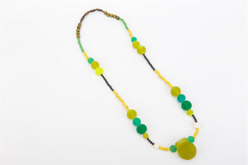
Lynette Lewis from Ernabella, Northern Territory, participated in an Indigenous Jewellery Project, which brought indigenous and European jewellers together to exchange skills. Jewellery has been made and worn by indigenous people for centuries, and Lewis’ threaded bead necklaces are based on the plants and seeds of her homeland. She uses beads from a variety of materials such as cast resin, glass, wood, coral, metals, natural quandong seeds, and howlite – a veined, borate mineral which has been dyed to resemble turquoise. These newly-introduced materials give scope for necklaces that are colourful, light in weight and beautifully made.
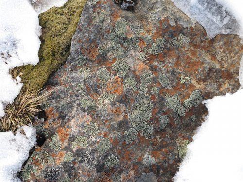
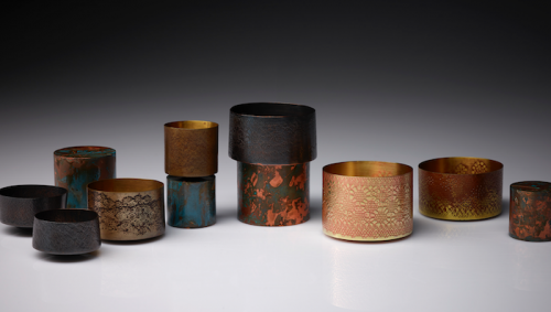
Some stunning digital prints on composite aluminium panels depict “kunanyi”, which is what Mount Wellington is now known, hang on the walls near the delicate jewellery and vessels being shown by Zoë Veness. The textures and colours of the lichen, the rock surface, and the tough, resilient vegetation are reflected in a series of pins in “A landscape of our making: rose petal pins”. The pins in copper, brass and sterling silver are organic in form and are the colours seen in the photographs, but also are reminiscent of rose petals. A series of small round vessels, similarly coloured and in copper or brass and some with surface decoration form “A landscape of our making: vessels and objects”.
“Butterfly gathering”, a long, long necklace from rings of brass on which are hung coloured metal butterfly shapes, exhibited on a tall stand, is a colourful and decorative work.
Heat and chemicals have been used to colour the thin slivers of metal. This method of colouring metal is not new, but Veness has taken it to a controlled level, creating delicate forms that evoke the ephemerality of rose petals and butterflies.
This artist, who now lives in Hobart, is also showing “Waiting for tomorrow”, which is made from tightly concertinaed paper, patiently folded and threaded onto a stainless steel cable with 10 karat gold tips and is definitely more sculptural than wearable
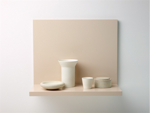
The title of the ceramics exhibition “A Space for Softness” by Kelly Austin might initially appear contradictory – ceramics are hard and cold. The softness comes from the colours, the surfaces and the arrangements of a series of often domestic and familiar objects in still-life groupings.
There is a risk with some of the objects and groupings that they are too still, and almost sterile. In association with the different forms, the introduction of colour through the use of clays, glazes and paint adds some life and tension. The groups are displayed on backed shelves in pale colours, often similar to the objects themselves but I find the forms disappear into the background colour.
When Austin is showing vessels, she achieves a crisp, fine rim, finishing the plain, walled forms. For example, “stilled composition no. 39” consists of two objects – a shallow circular bowl-form, and a terracotta-coloured closed cylinder. The bowl is smooth and white, while the dark cylinder is slightly textured. There is a fine tension between the two objects and for me this is the most successful work in the collection.
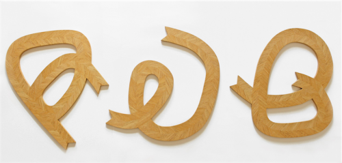
Parquetry is the geometrical inlay, or veneer, of different coloured timbers or of the same timber with the grain arranged to form patterns or designs. Chelsea Lemon uses contrasting coloured timber – African Yaya, Tasmanian Ash and Red Ironbark, in works such as “Protea” with pale timber at the top, falling to deep red highlights at the lower tips. The central work in her exhibition is “Serrated Table” in Blackwood. The timber has been cut obliquely and placed on the diagonal with the strong character of the wood creating a vigorous, dynamic surface. The serration carries over to the short edge of the table and the stretcher. This table would become an heirloom to the family which owns it.
Good design, however it is defined, which should be integral to all art and craft and these shows demonstrate their maker’s deep understanding of design as it relates to their materials.
Who can be trusted?
In a world of spin and confusion, there’s never been a more important time to support independent journalism in Canberra.
If you trust our work online and want to enforce the power of independent voices, I invite you to make a small contribution.
Every dollar of support is invested back into our journalism to help keep citynews.com.au strong and free.
Thank you,
Ian Meikle, editor


Leave a Reply