“Canberra Matters” columnist PAUL COSTIGAN casts an eye across three new additions to the Canberra architectural landscape.
 MANUKA
THIS city is fairly ordinary when it comes to public architecture. There are a few exceptions, often Federal buildings and those on the ANU, but not many. With the rush of towers appearing across the city, things are not getting better. There’s a load of ugly stuff out there!

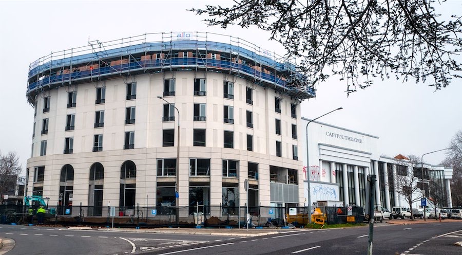
Which brings me to the replacement building for the theatre site in Manuka by Liangis Developments. There has been a lot of debate about this development.
Given the not-so-kind remarks by some, it is obvious that this developer has not attended enough industry and official functions to curry favour as is the norm in this town.
Some are critical of the building’s design. Maybe what is appearing is a very derivative of former European architecture. That is what design is often about – taking something from the past and reworking it.
But more importantly, when compared with what is being thrown up around town thanks to the ever-presence bland style of the post-modern international architectural clans – this Manuka building should be celebrated. For a city with very ordinary stuff as the norm, this building is definitely far more interesting.
There are stories doing the rounds that although the second stage of Manuka building is approved, it has been subject to some very silly conditions. There is talk of the government demanding that a passage be built through the centre to open it up for foot traffic. Where are they going? To admire the busy side of the Canberra Avenue – because to travel any further they would walk to the corners in each direction – as they would have had to do anyway.
I hope the developer can arrange for something extraordinarily very public to show up how stupid the Planning Directorate’s and the NCA’s decisions have been for this site. It is time for the planners to let go of this and to get on with their job – it is called planning.
Manuka needs a building with some architectural interest as there’s not much else of interest in the shopping centre. This centre, as with most other centres around the city, needs an injection of a variety of interesting (and possibly controversial) architectural styles. Some stuff that will make people talk about good design.
 NORTHBOURNE AVENUE
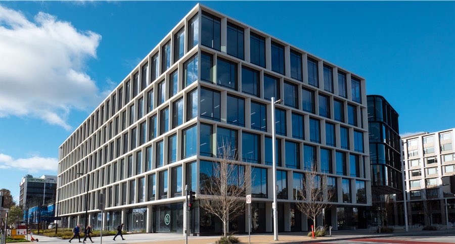
THE in-crowd of developers and in-house government planners and architects have celebrated that new government occupied building at 480 Northbourne, the tower occupied by the Planning Directorate.
Have a look at the image above and try to get excited by its charm. Is this the new Federal style that the National Capital Design Review Panel thinks should be the standard that others should emulate?
 ANZAC PARADE
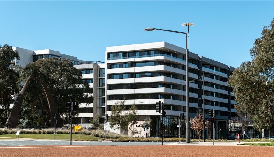
THE there are the new standards being set at the bottom of Anzac Parade. We are yet to see what wonder will appear in place of the demolished Anzac East building, but the entrance to Anzac Parade is already graced with the corner block of the award-winning Campbell 5 apartment complex (above). Maybe this is the new aesthetic standard for Canberra?
There are heaps of bland box towers of concrete and glass in this town – all of which fit in with the current international style dominating Australia’s cities.
Surely given that this is a city in the landscape, there must be someone within this government that has some interest in aesthetics and who should be working hard to stop the onslaught of boring stuff popping up across the city. Is this the New Normal that we were promised?
Who can be trusted?
In a world of spin and confusion, there’s never been a more important time to support independent journalism in Canberra.
If you trust our work online and want to enforce the power of independent voices, I invite you to make a small contribution.
Every dollar of support is invested back into our journalism to help keep citynews.com.au strong and free.
Thank you,
Ian Meikle, editor


Leave a Reply